The psychology of color in design explores how hues, shades, and combinations shape emotional responses, perceptions, attention, and decision-making. A shopper who trusts a blue banking app, a diner drawn to a red restaurant sign, and a visitor calmed by a green wellness site are all responding to color before reading a single word.
Understanding color associations matters across graphic design, web design, branding, advertising, and product design. Still, effective choices never rely on universal stereotypes. The right color reflects the intended message, target audience, and design context.
Understanding the Psychology of Color and Its Influence on Human Perception
Color psychology rests on a simple premise: visual perception links colors to emotions, memories, and behavioral responses. The brain processes color almost instantly, forming impressions before conscious analysis begins.
It helps to separate two ideas. Common color associations (red means passion, green means nature) are widely shared but culturally learned. Scientifically established effects are narrower: for example, high-contrast and saturated colors attract attention faster, and brightness affects legibility. Designers who recognize this distinction avoid overstating what a color can do and instead use it as one tool among many to build intentional visual experiences. For a deeper academic overview, see Color Psychology on Wikipedia.
How Colors Influence Emotions, Mood, and Decision-Making
Colors shape emotional impressions, perceived energy, and attention, and they guide how people interpret visual information. A bright accent draws the eye; a muted palette invites slower reading.
Responses are never purely biological. They are shaped by learned associations, personal experiences, environmental influences, and visual context. A red button means “stop” on a form error but “buy” on a sale banner.
Common emotional responses linked to color characteristics include:
- Warmth: reds, oranges, and yellows feel energetic, friendly, and inviting.
- Calmness: soft blues and greens suggest relaxation and stability.
- Excitement: saturated, high-contrast combinations create urgency and stimulation.
- Sophistication: deep, dark, or restrained tones convey elegance and exclusivity.
The Role of Hue, Saturation, Brightness, and Color Temperature
Every color has three fundamental dimensions:
- Hue: the pure color family (red, blue, green).
- Saturation: the intensity or purity of the hue.
- Brightness (lightness): how light or dark the color appears.
Changing any one alters the impression. Warm colors (red, orange, yellow) feel active and advance visually, cool colors (blue, green, purple) feel calm and recede, and neutrals (black, white, gray, brown) provide structure and balance.
Shade matters as much as hue. Pastels feel soft and gentle, vivid tones feel bold and youthful, muted tones feel mature and refined, and dark shades feel serious or luxurious, even within the same color family.
| Color Characteristic | Typical Emotional Association | Design Application |
|---|---|---|
| Warm, saturated | Energy, urgency, appetite | Promotions, food branding, CTAs |
| Cool, muted | Calm, trust, professionalism | Finance, healthcare, SaaS |
| Pastel | Softness, care, playfulness | Baby products, beauty, wellness |
| Dark, low-brightness | Luxury, authority, mystery | Premium brands, editorial design |
| Neutral | Balance, simplicity, restraint | Backgrounds, minimalist layouts |
Why Color Psychology Is Not Universal
Cultural background, age, personal experience, geography, and social conventions all influence how colors are read. White, for instance, signals purity and weddings in many Western contexts, yet is associated with mourning in some East Asian traditions. Red suggests luck and celebration in China but can signal danger or debt elsewhere.
Because of this, designers should research their target audience rather than assume every color triggers the same response. When designing for international audiences, consider:
- Cultural symbolism of key colors in each target market
- Religious and traditional associations
- Age group and generational preferences
- Local industry conventions (for example, medical or financial norms)
- Regional testing with representative users
What Different Colors Mean in Design: Emotional Associations and Practical Uses
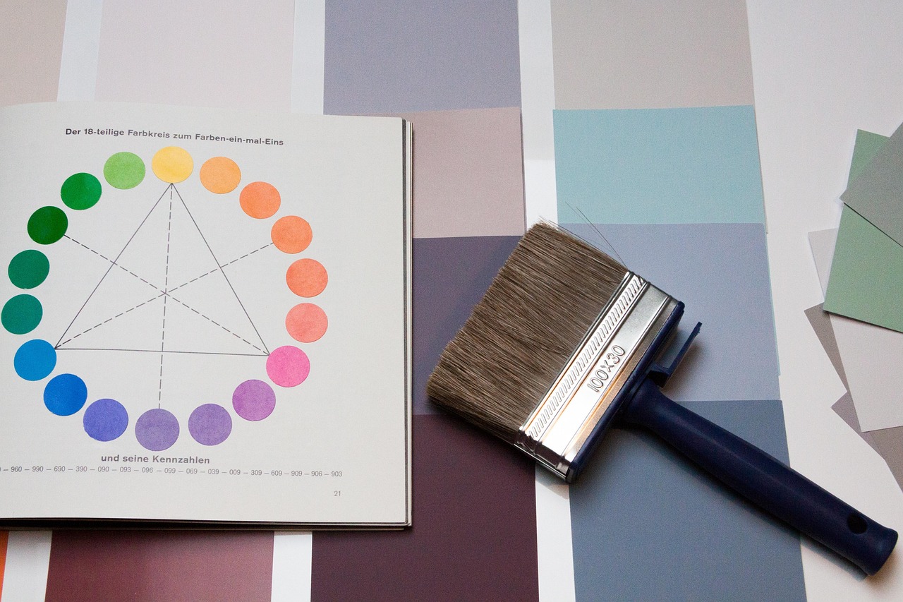
Every color carries both positive and negative associations, and the impression changes with shade, surrounding colors, and application. Red can signal passion or danger; green can feel fresh or sickly. Context decides which reading wins.
Red, Orange, and Yellow: Energy, Excitement, and Attention
Red conveys passion, urgency, confidence, danger, and excitement. It dominates promotional graphics, food branding, entertainment, and calls to action, where it stimulates quick decisions.
Orange blends red’s energy with yellow’s cheer, suggesting creativity, enthusiasm, friendliness, and playfulness. It suits approachable brands and energetic marketing materials.
Yellow is the most visible hue, associated with optimism, happiness, and mental stimulation. It works well in attention-grabbing elements, youthful branding, and cheerful identities.
- Red: Best for sales, urgency, and appetite appeal. Drawback: can feel aggressive or signal errors.
- Orange: Best for friendly, creative brands and CTAs. Drawback: can look cheap if overused.
- Yellow: Best for highlights, warnings, and youthful brands. Drawback: poor text contrast on white and eye fatigue in large areas.
Blue, Green, and Purple: Trust, Balance, and Creativity
Blue signals trust, reliability, stability, and calmness, which explains its prevalence in financial services, technology, healthcare, and corporate branding.
Green evokes nature, growth, freshness, balance, and sustainability, fitting wellness, environmental, and health-related design.
Purple combines calm and energy, suggesting creativity, imagination, luxury, sophistication, and mystery. It is common in premium branding, beauty, and creative industries.
Shade shifts the impression dramatically:
- Navy blue feels authoritative and corporate; sky blue feels friendly and open.
- Forest green suggests heritage and stability; lime green feels energetic and modern.
- Lavender feels gentle and soothing; deep violet feels regal and dramatic.
Black, White, Gray, and Brown: Simplicity, Elegance, and Stability
Black communicates luxury, authority, power, and mystery, though heavy use can feel intimidating. White suggests simplicity, cleanliness, clarity, and openness, but risks looking sterile or empty. Gray offers neutrality and professionalism, yet can turn dull or impersonal. Brown conveys reliability, warmth, authenticity, and traditional craftsmanship.
| Neutral | Main Associations | Common Applications | Potential Disadvantages |
|---|---|---|---|
| Black | Luxury, power, sophistication | Fashion, premium products, typography | Heavy, intimidating |
| White | Clarity, minimalism, openness | Backgrounds, healthcare, tech | Sterile, empty |
| Gray | Neutrality, balance, restraint | Corporate UI, secondary elements | Dull, impersonal |
| Brown | Reliability, warmth, craftsmanship | Coffee, outdoor, artisan brands | Dated or heavy if overused |
How to Apply Color Psychology to Create Effective Designs

Translating theory into practice means choosing colors based on communication goals, audience expectations, brand identity, and usability, not trends alone. The goal is a cohesive palette that you can evaluate and refine.
Choosing Colors That Match Your Brand Identity and Target Audience
Start by defining the brand personality, then match colors to brand values, product positioning, industry expectations, and customer demographics. Approaches differ widely: a luxury brand favors black, gold, or deep jewel tones; a children’s brand uses bright, saturated primaries; a technology company leans on blue, gray, or electric accents; an eco-friendly business relies on earthy greens and browns.
Follow these steps to select a brand palette:
- Define the brand message and core values.
- Identify the target audience and their expectations.
- Choose a dominant primary color that reflects the brand personality.
- Add secondary and accent colors to support hierarchy.
- Research competitors to differentiate while respecting industry norms.
- Test color options with real users before finalizing.
Using Color Psychology in Web Design and User Interfaces
Color affects first impressions, navigation, readability, visual hierarchy, and interaction. Strategic use of accent colors, backgrounds, buttons, links, notifications, and calls to action guides users toward key actions. Consistency is essential: when interactive elements share a recognizable color, users instantly understand what is clickable and what state an interface is in. For accessibility benchmarks, review the W3C Web Content Accessibility Guidelines.
Practical choices for common UI elements:
- Primary buttons: a saturated, high-contrast accent (such as blue or orange) for main actions.
- Links: a consistent color, ideally with underlines for clarity.
- Success messages: green; warnings: amber or yellow; errors: red.
- Backgrounds: neutral whites or soft grays to support readability.
Creating Balanced Color Combinations and Effective Visual Hierarchy
Harmonious compositions rely on proven schemes combined with contrast, balance, dominant and accent colors, and negative space. The 60-30-10 rule (60% dominant, 30% secondary, 10% accent) is a flexible starting point, not a strict requirement.
| Color Scheme | Characteristics | Suitable Applications |
|---|---|---|
| Complementary | Opposites on the wheel; high contrast | Posters, CTAs, sports branding |
| Analogous | Neighboring hues; smooth and calm | Wellness, nature-themed design |
| Monochromatic | One hue in varied shades; cohesive | Minimalist brands, editorial |
| Triadic | Three evenly spaced hues; vibrant | Playful, creative, children’s design |
Common Color Psychology Mistakes Designers Should Avoid
Even attractive designs fail when color decisions ignore context. Insufficient contrast, inconsistent usage, and poor accessibility undermine usability regardless of aesthetics.
- Following trends alone: anchor choices in brand strategy instead.
- Relying on stereotypes: validate assumptions through audience research.
- Using too many competing shades: limit the palette and define roles for each color.
- Ignoring cultural differences: research each target market.
- Weak contrast and accessibility: check ratios against WCAG standards.
Always test with real users and review colors across different screens, backgrounds, and viewing conditions, since the same shade can look dramatically different on a phone, a monitor, or in print.
Conclusion
The psychology of color in design helps designers communicate messages, establish brand identity, influence perceptions, and create meaningful user experiences. Yet color meanings are never fixed: they depend on context, culture, shade, saturation, and audience expectations.
The strongest designs balance psychological associations with visual harmony, functionality, and accessibility. Choose colors with a clear purpose, build a cohesive palette, and test how your design communicates with its intended audience.